Introduction to PSD to HTML/CSS Conversion
Converting Photoshop Design (PSD) files to HTML and CSS plays a crucial role in web development. This process transforms static PSD designs into interactive, functional websites. Initially, PSD files acted as blueprints for developers to create web pages. The PSD to HTML/CSS conversion ensures that designs are faithfully replicated while optimizing them for different browsers and devices. Over time, this process has evolved, with new tools, advanced techniques, and best practices now enhancing both efficiency and versatility.
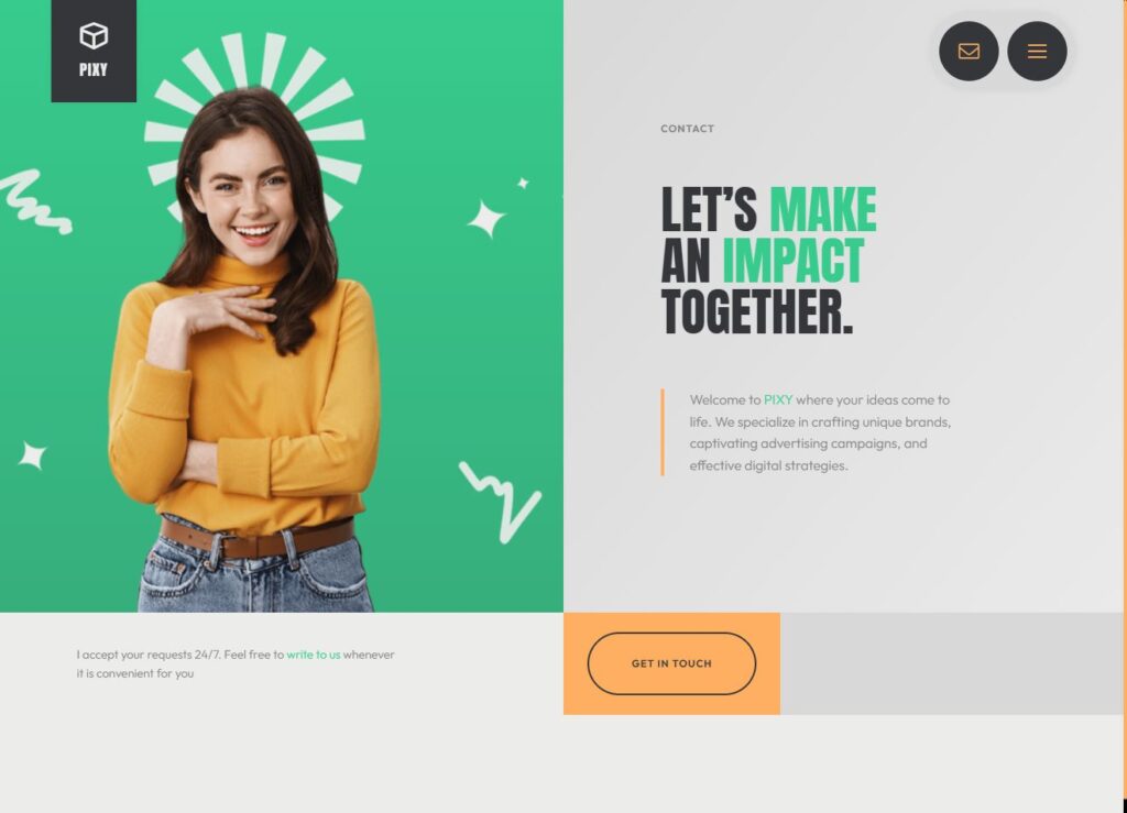
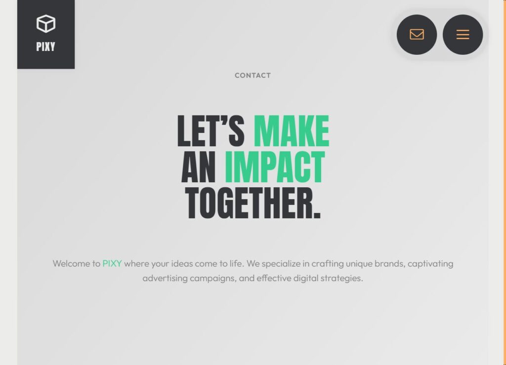
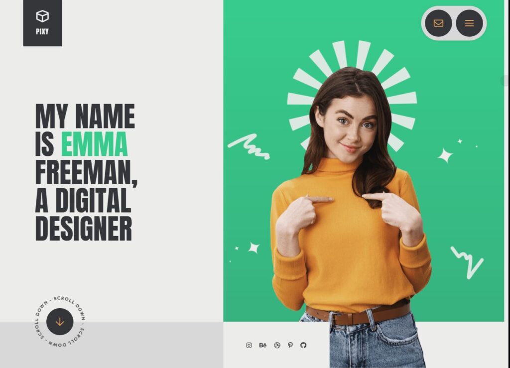
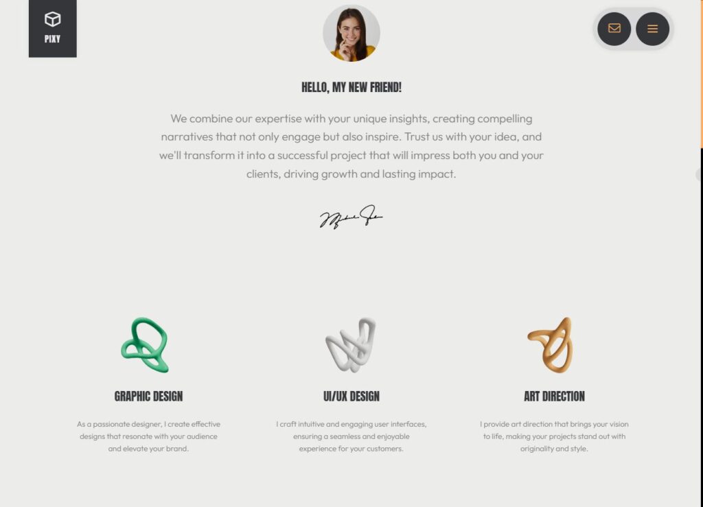
Convert PSD/Figma to HTML
Created by: @Boroji Design Inc
Created by: @AyyazTech
Responsive Design and Mobile-First Approach
- Mobile-First Philosophy: Prioritizes designing for mobile devices first. This ensures the website is optimized for smaller screens before scaling up to larger devices.
- Responsive Design: Guarantees that the website adapts to different screen sizes, providing a seamless user experience on smartphones, tablets, and desktops.
- Media Queries: CSS uses media queries to apply styles based on device characteristics like width, height, and orientation.
- Flexible Grids: A layout system using relative units, such as percentages, rather than fixed widths. This approach allows designs to adjust to screen sizes.
- Responsive Images: Images adjust or are replaced depending on the user’s device. This improves both performance and display quality.
- User-Centric Experience: Emphasizes usability and accessibility, making websites functional and aesthetically pleasing on all devices.
The Rise of Photoshop and PSD Design Files
- Photoshop as a Web Design Tool: Photoshop became the primary tool for web designers, offering powerful features to create detailed, pixel-perfect designs.
- PSD Files as a Standard: PSD files became the standard in web design. Their versatility and ability to work with layers and high-quality visuals made them indispensable.
- Non-Destructive Editing: The layer-based structure of PSD files allowed designers to modify parts of the design without altering the entire project.
- High-Quality Designs: PSD files enabled designers to create intricate visuals, such as gradients, shadows, and textures, translating into visually rich websites.
- Challenges in Conversion: Despite their usefulness, translating PSD files into code was a time-consuming process that required precision.
Early PSD to HTML/CSS Conversion Process
- Manual Slicing: Designers sliced PSD files into image assets, such as buttons, backgrounds, and icons, and provided them to developers.
- HTML Structure: Developers manually created webpage layouts using HTML, positioning images and text in fixed locations.
- CSS Styling: CSS was used to style text, backgrounds, and other elements. However, layouts were often rigid, not as flexible as modern designs.
- Image-Heavy Designs: Websites relied heavily on images, making pages load slower and less responsive.
- Limited Flexibility: The design process resulted in non-flexible layouts that didn’t adapt well to different screen sizes or devices.
Responsive Design and Mobile-First Approach
With the rise of mobile devices, responsive web design became a game-changer. The mobile-first approach emphasized designing for mobile devices first, ensuring websites functioned well on smaller screens. Developers now used media queries, flexible grids, and responsive images to create layouts that adjusted seamlessly across all devices. This shift significantly impacted the PSD to HTML conversion process, forcing designers to consider how their designs would appear on various screen sizes.
Automation and Modern Tools
- Design Tool Shift: Tools like Figma, Sketch, and Adobe XD have replaced Photoshop, offering more intuitive features for web design.
- Web-Specific Design: These tools focus on digital/web design, simplifying the design process for developers and designers alike.
- Prototypes & Design Systems: Designers can now create prototypes, style guides, and systems directly in these tools.
- Streamlined Handoff: Tools like Avocode and Zeplin automate the handoff process, providing developers with accurate specs, images, and code snippets.
- Faster Workflows: Modern tools streamline the PSD to HTML conversion process, making workflows more efficient.
- Collaboration & Accuracy: Real-time collaboration and direct exports ensure accuracy and smooth coordination between designers and developers.
- Responsive Design: Built-in features make it easier to create responsive layouts for multi-device compatibility.
Challenges in PSD to HTML/CSS
- Cross-Browser Compatibility: Different browsers render HTML and CSS differently. Ensuring consistent design across all platforms remains challenging.
- Performance Optimization: Large image files, excessive CSS/JS files, and inefficient code lead to slower load times, negatively impacting website performance.
- Manual Workload: The manual process of slicing images, creating HTML structures, and styling with CSS can be time-consuming and prone to errors.
- Responsiveness Issues: Ensuring the design adapts seamlessly across all devices requires careful planning and extensive testing.
- Accessibility Concerns: Websites must be designed with accessibility in mind to ensure all users, including those with disabilities, can use the site without issues.
Future of PSD to HTML/CSS
- AI-Powered Tools: AI and machine learning are beginning to automate parts of the conversion process, speeding up workflows and reducing human error.
- No-Code Platforms: These platforms enable users to design websites without needing to write code, simplifying the PSD to HTML conversion.
- Advanced CSS Layouts: Techniques like Flexbox and CSS Grid are becoming more common, providing flexible, responsive layouts without relying on image-heavy designs.
- Seamless Integration of Design and Code: Tools like Figma, Sketch, and Adobe XD streamline the handoff between designers and developers, improving collaboration and speeding up the conversion process.
- Better Mobile Optimization: The focus on mobile-first design will continue to drive improvements, ensuring websites are optimized for all devices.
- Collaboration in Real-Time: Future tools will enable real-time collaboration, reducing the gap between design and code.
Objective: Learn how to convert a PSD design into a functional web page using HTML and CSS.
Assignment Details:
- Download the provided PSD file (you can share one or allow students to choose from free PSD resources like Freepik).
- Analyze the PSD layers and understand the structure of the design.
- Using HTML, create a semantic structure for the design.
- Style the page using CSS to match the layout, fonts, colors, and spacing of the PSD file.
- Ensure the final page is responsive on all screen sizes (use media queries).
- Submit both the PSD file and the working HTML/CSS files.


Objective: Practice designing and coding a functional personal portfolio page.
Assignment Details:
- Create a simple personal portfolio web page with the following sections:
- Header: Include a navigation bar and a logo or name.
- About Me: Add a brief introduction.
- Projects/Work: Showcase at least 2 sample projects (real or imaginary).
- Contact: Include a simple form with fields like Name, Email, and Message.
- Use HTML for the structure and CSS for styling.
- Add visual design elements such as hover effects, transitions, and shadows to enhance the UI/UX.
- Optionally, use Figma or a simple wireframe tool to plan your design before coding.
- Submit the HTML/CSS files and a live demo link if hosted online (e.g., GitHub Pages).


Report abusive, offending, missing or broken link report@prodesignschool.com
Join Our Mail List
To get latest updates on courses and news regarding education.