Children’s Book Illustrations
Children’s Book Illustrations are a great way to introduce your child to art and Children’s Book Design. They can learn about color, composition, perspective, and other artistic concepts while having fun! Illustrations are a great way to learn about different topics. Children can easily understand what they are looking at if the pictures are simple enough. They can also relate to them better than reading words alone. This is especially true for young children who may not yet have developed their own vocabulary.
Illustrating Children’s Book
Created by : @Adobe Creative Cloud
1. Importance of Color in Children’s Book Design
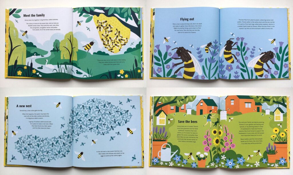
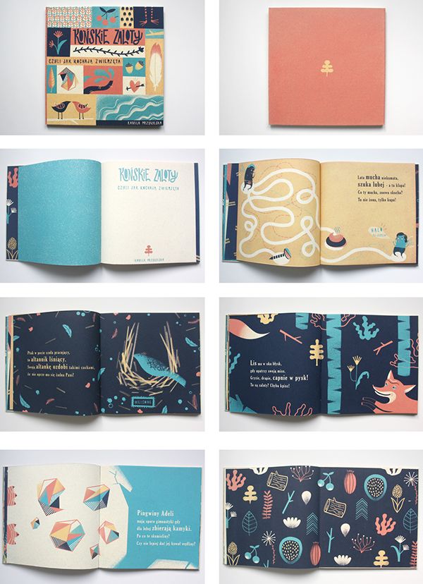
Color plays a crucial role in children’s book design, helping to attract attention, evoke emotions, and reinforce the story. Vibrant, bold colors engage young readers and draw them into the narrative. For example, red and yellow may convey excitement, while blue and green evoke calmness. As children grow older, more nuanced color schemes can be introduced, such as pastel tones for older toddlers or earth tones for pre-teens. Color not only enhances visual appeal but also complements the text and illustrations, enriching the overall experience.
- Attracts Attention: Bright, bold colors engage young readers and draw them into the story.
- Evokes Emotion: Colors like red and yellow convey excitement, while blue and green evoke calmness.
- Age-Specific Choices: Younger children respond well to vibrant colors, while older children can handle more muted or sophisticated color schemes.
- Enhances Visual Appeal: Colors complement the text and illustrations, enriching the overall experience.
2. Typography Choices for Children’s Books
Typography in children’s books needs to balance fun with functionality. Large, clear fonts are essential for early readers, helping them easily recognize words. As children grow older, a more sophisticated font can be introduced. The use of varied typography, such as bold or italic, can also emphasize key parts of the story, adding excitement and clarity to the reading experience.
- Legibility: Large, clear fonts are essential for early readers to recognize words easily.
- Fun vs. Function: Fonts should balance playfulness with readability. Rounded, sans-serif fonts work well for younger readers.
- Age-Appropriate Fonts: As children grow, fonts can become slightly more sophisticated, using serif fonts for older readers.
- Emphasizing Key Text: Playful variations of typography like bold or italic can highlight key elements of the story.
3.Children’s Book Illustration Styles: Enhancing Storytelling
Illustrations in children’s books are central to storytelling. They help young readers visualize the narrative, making it easier to understand complex ideas and emotions. Whimsical, colorful illustrations tend to work well for younger children, while older readers may prefer more detailed and realistic drawings. Illustrations should complement the tone of the story, whether light-hearted, adventurous, or somber.
- Visual Storytelling: Illustrations help children visualize the narrative and comprehend the story’s emotions.
- Whimsical vs. Realistic: Younger children enjoy colorful, whimsical illustrations, while older children may prefer more detailed, realistic artwork.
- Tone of the Book: Illustrations should complement the book’s theme (e.g., playful for adventures, subdued for serious topics).
- Diversity and Inclusivity: Diverse characters and settings provide children with relatable, broad experiences.
4. Layout and Page Design: Keeping Children Engaged
The layout of a children’s book is as important as its illustrations. A well-designed page should encourage the reader to stay engaged without overwhelming them. The text should flow naturally with the illustrations, ensuring a seamless reading experience. White space is crucial to avoid a crowded page and to help young readers focus on the important elements.
- Balanced Design: Text and images should work together harmoniously, allowing for a smooth flow across pages.
- Use of White Space: Adequate white space prevents the page from feeling crowded, allowing children to focus on key elements.
- Interactive Layouts: Text and illustrations can be arranged to interact with each other, adding excitement and enhancing storytelling.
5. Target Age Group Considerations
When designing a children’s book, the target age group plays a significant role in determining the design. For babies and toddlers, books should have simple, large pictures with very few words, often paired with tactile elements like flaps or textures. As children grow, the stories can become more complex with longer text and more intricate illustrations. The design should reflect the developmental stage and reading abilities of the intended age group.
- Infants & Toddlers: Simple, large pictures with minimal text and tactile elements (e.g., flaps, textures).
- Preschool Age: Stories with more complex narratives and slightly longer text; vibrant illustrations help tell the story.
- Older Children: Books with structured design, appropriate fonts, and more detailed illustrations support independent reading.
6. Creating Visual Consistency
Consistency in design ensures a cohesive reading experience, allowing children to stay focused on the story. Every element, from the characters’ appearance to the colors and typography, should remain consistent throughout the book. This familiarity helps children follow the narrative more easily and feel comfortable with the book.
- Character Consistency: Ensure characters, colors, and designs remain the same throughout the book for familiarity.
- Reinforcing the Story: Consistent visual elements strengthen the narrative, making it easier for children to follow.
- Harmonious Design: A cohesive design with consistent elements creates a seamless reading experience.
7. Designing for Education and Learning
Children’s books often serve as valuable educational tools. Design can play an important role in making learning fun and interactive. Educational elements such as numbers, letters, shapes, and colors can be integrated into the illustrations, turning the book into an engaging learning tool. Additionally, educational books can incorporate moral lessons and other life lessons that help guide young minds.
- Incorporating Educational Elements: Integrate numbers, letters, shapes, and colors in illustrations to enhance learning.
- Moral Lessons: Visual cues (e.g., character expressions) should subtly reflect the story’s moral or message.
- Interactive Features: For educational books, design elements can encourage active learning, such as puzzles, quizzes, or “find the object” games.
8. Designing for Digital vs. Print
When designing for children’s books, the format—digital or print—can change the approach. Digital books require layouts that are compatible with various screen sizes and allow for interactivity, like touch responses or animations. Print books focus more on tactile experiences, such as paper quality, binding, and page size, creating a different kind of reading experience. Regardless of the format, the design should be engaging, intuitive, and user-friendly for children.
- Print Books: Focus on tactile experiences, such as paper quality, binding, and size, to make the physical book enjoyable.
- Digital Books: Adapt layouts for screen sizes, with added interactivity like touch responses or animations.
- User-Friendly: Both formats should provide a seamless, engaging experience that’s easy for children to navigate.
9. Collaborating with Illustrators and Authors
Collaboration between the designer, author, and illustrator is vital to producing a successful children’s book. The designer needs to ensure that the visual elements align with the tone and message of the story, while working with the illustrator to create consistent character designs, settings, and scenes. This teamwork ensures that the final book is visually appealing and narratively cohesive.
- Collaboration: Work closely with authors and illustrators to create a cohesive story and visual experience.
- Aligning Design with the Story: Ensure that visual elements like colors, typography, and illustrations match the tone and theme of the story.
- Visual Consistency: Maintain consistent designs and characters throughout the book to enhance storytelling.
10. Adapting to Trends and Innovations in Children’s Book Design
Children’s book design is continuously evolving, with new trends and innovations emerging regularly. From augmented reality (AR) to interactive elements, the possibilities are expanding. Designers should stay informed about new trends and technologies to create cutting-edge books that meet the needs and expectations of modern children and parents. Additionally, sustainability and eco-friendly printing practices are becoming increasingly important.
- Augmented Reality (AR): Incorporating AR to create interactive and immersive reading experiences.
- Sustainability: Use eco-friendly printing practices and materials to make books more sustainable.
- Staying Updated: Keep up with emerging design trends and technologies to remain competitive and relevant.
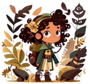
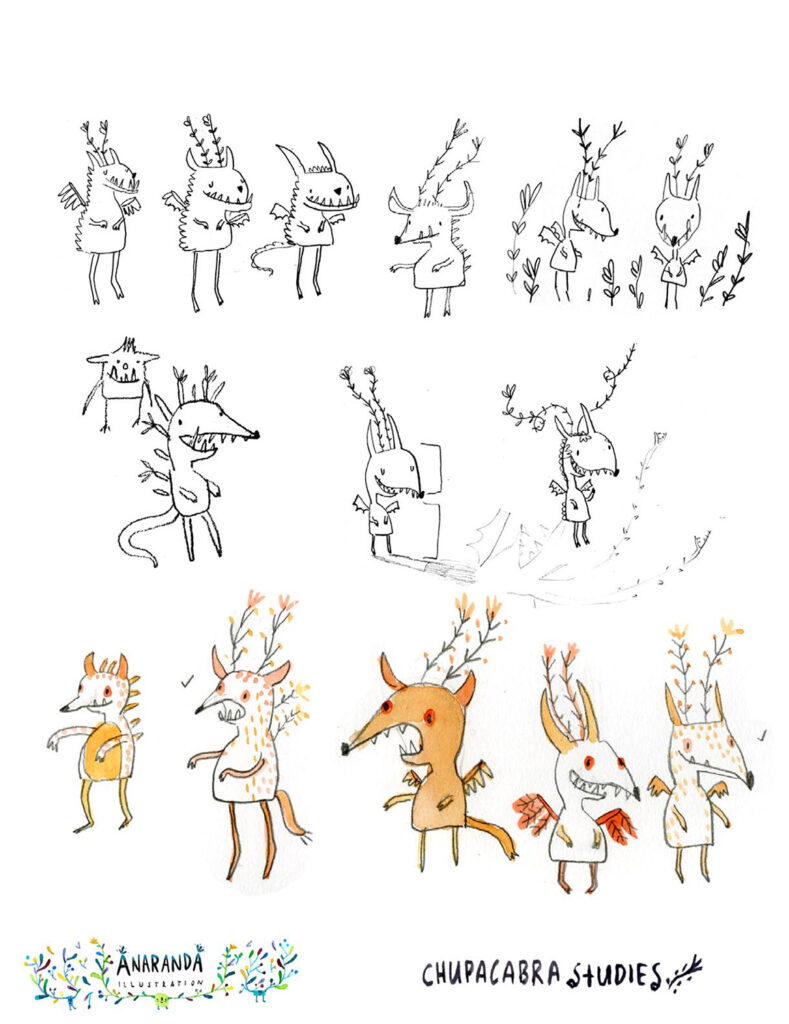
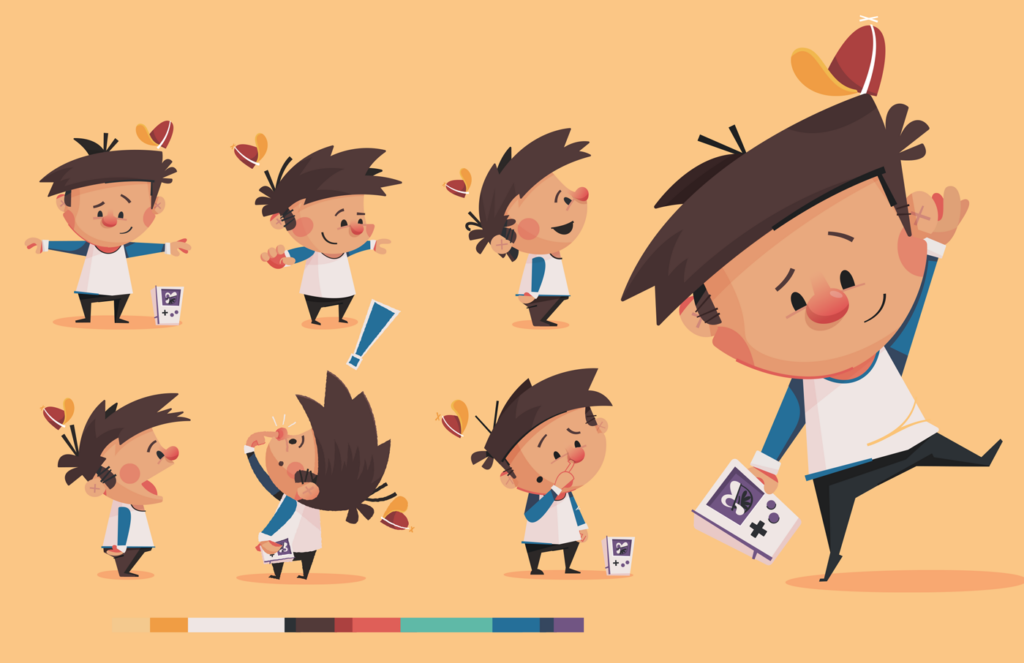
Objective: To create a unique, child-friendly character for a storybook.
- Choose an age group for your book’s audience (e.g., 3–5 years, 6–8 years).
- Design a main character for your book. It can be a child, animal, or even an imaginary creature.
- Use simple shapes, vibrant colors, and playful expressions to make the character appealing to children.
- Create three different poses or expressions for the character to show its personality
(e.g., happy, curious, surprised).
Deliverables:
- Sketches or digital illustrations of the character in three different poses.
- A short description (3–5 sentences) of the character’s personality, background, and role in the story.
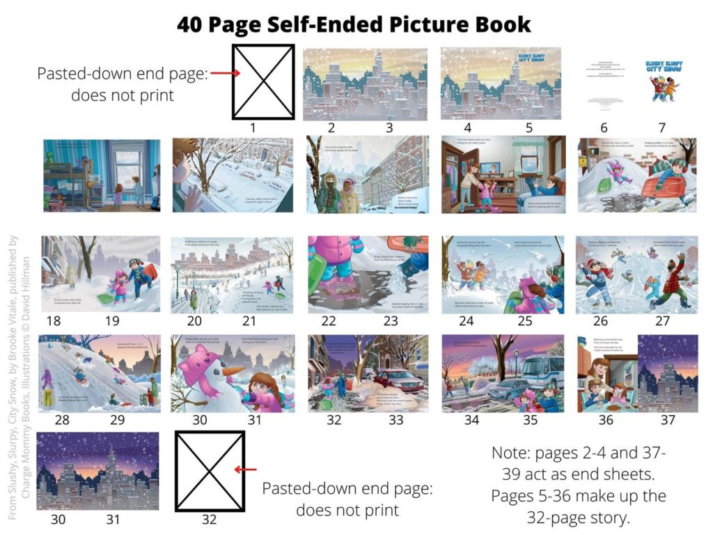
Objective: To create a sample layout for a two-page children’s book spread.
- Write a short text or dialogue (50–100 words) suitable for a children’s book. It could be a rhyme, story snippet, or interaction between characters.
- Design the layout for a two-page spread, incorporating:
- Illustration: Draw a scene that complements the text.
- Text Placement: Use clear and readable fonts with proper spacing.
- Color Palette: Choose a child-friendly color scheme.
Deliverables:
- A complete two-page spread, including text and illustrations (can be hand-drawn or digital).
- Provide a brief explanation of the layout choices (why you used specific colors, fonts, and illustration style).
Report abusive, offending, missing or broken link report@prodesignschool.com
Join Our Mail List
To get latest updates on courses and news regarding education.