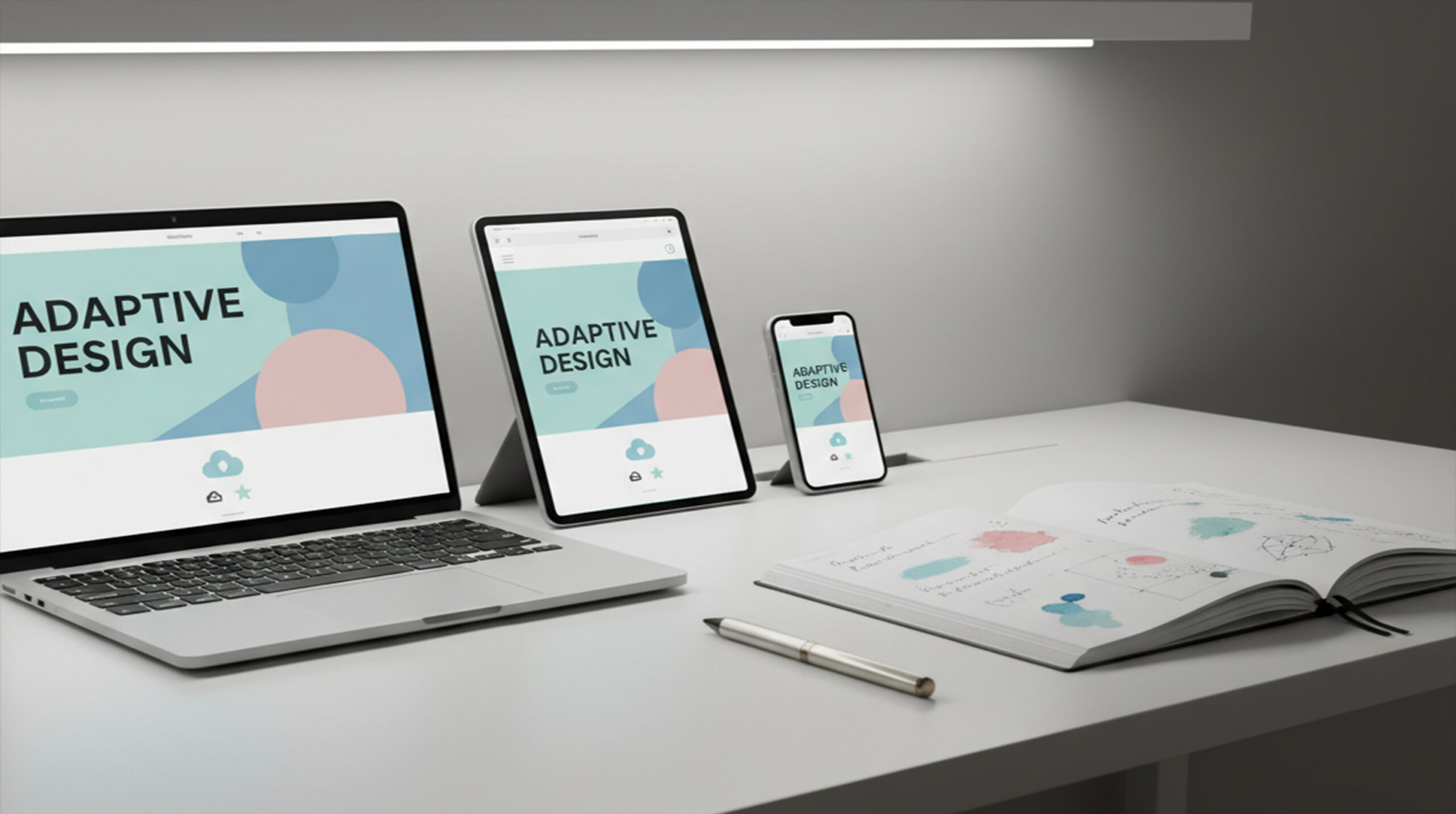
In a multi-device world, Typography & Icon Systems shape how users experience your brand. From wearable screens to ultra-wide monitors, each pixel demands adaptable yet coherent design systems that unify form and function across platforms.
This article explores techniques to make type and icons scale intelligently — ensuring beauty, usability, and accessibility on every interface.
The Foundation of Responsive Type
Responsive typography adjusts not only size but proportion, rhythm, and spacing. Designers must think fluidly — every heading, paragraph, and caption should adapt seamlessly as screen dimensions change.
As Smashing Magazine suggests, “content drives design.” Your text should breathe naturally whether it’s on a smartphone or 4K display.
Practical Fluid Sizing with CSS
Modern CSS provides elegant methods like clamp() to balance minimum, preferred, and maximum sizes:
font-size: clamp(1rem, 1.2vw + 0.8rem, 2rem);This single line ensures type grows proportionally with screen width while maintaining legibility. Combine this with consistent line-height ratios to preserve reading comfort.
Establishing a Modular Type Scale
A modular scale creates visual harmony. Choose ratios like 1.25 or 1.333 and apply them from captions to headings. Tools such as TypeScale can help generate CSS tokens for your entire project.
A consistent type scale makes typography predictable — essential for responsive interfaces and team collaboration.
Accessibility and Readability
Always design with accessibility in mind. Use relative units (rem, em) and test with browser zoom. The WCAG 2.1 guideline requires text to be resizable up to 200% without loss of content or functionality.
Increasing contrast ratios and ensuring minimum 16px base font sizes improve legibility for low-vision users — a must for inclusive design.
Creating Scalable Icon Systems
Icons should be built with purpose, not decoration. Maintain geometric consistency using 24dp or 48dp grids, ensuring visual balance across platforms. Follow the Material Design Icon Guidelines for spacing and stroke uniformity.
SVGs and variable icon fonts enable weight adjustments dynamically — lighter strokes for dense UIs and bolder ones for small mobile layouts.
Design Tokens and Consistency
Design tokens centralize values like color, font size, and spacing. Define them in a shared JSON or CSS variables file to maintain cross-device consistency:
:root {
  --font-base: 1rem;
  --font-h1: clamp(1.8rem, 2.5vw, 3rem);
  --icon-md: 24px;
}
When teams align on tokens, handoff between design and development becomes frictionless and scalable.
Testing on Real Devices
Responsive design can’t rely solely on emulators. Test across device types — phones, tablets, desktops, and even TVs. Observe how font weights, line heights, and icons behave under different resolutions and zoom levels.
For detailed testing strategies, explore Google Developers’ responsive design guide, which explains viewport scaling and grid responsiveness.
Performance and Optimization
Large web font files or multiple icon libraries can slow loading times. Subset your fonts to include only required glyphs and compress SVGs using tools like SVGOMG.
Use font-display: swap in CSS to avoid invisible text during load. A fast interface supports better UX and SEO performance.
Evolving Trends in Typography & Icons
Designers are embracing variable fonts that adjust weight and width dynamically, giving more flexibility in responsive layouts. Similarly, animated SVG icons communicate status and feedback effectively without consuming much bandwidth.
Keeping an eye on Google Fonts Variable Collection helps you stay updated with evolving responsive design trends.
Conclusion
Responsive typography and icons form the backbone of adaptable design. By balancing scalability, accessibility, and aesthetics, designers can deliver experiences that feel native on any screen — large or small. Consistency, testing, and system thinking are the timeless pillars of great digital design.