The Power of Typography in Branding: Tips from the Pros
By Trupti on 11 Aug 2025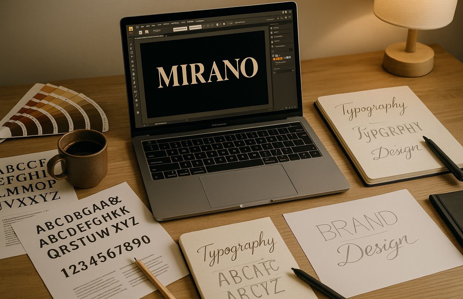
Fonts aren’t just letters. They’re silent messengers. They tell your audience if your brand is friendly or serious, modern or timeless, playful or premium — before they even read the words.
In branding, typography is more than design decoration. It’s a core part of how people feel about your business. Let’s break down why typography matters so much, and how you can use it like the pros do.
1. Your Font Is Your First Impression
Before a visitor reads your tagline, they notice the font. Is it bold? Minimal? Flowing? Quirky? That’s your brand speaking.
- A sleek sans-serif = modern and approachable.
- A serif with high contrast = elegant and premium.
- A playful script = creative and personal.
Tip: Think of it as the “voice” of your visuals. Get it right, and people hear your brand’s personality before they read a word.
2. Consistency Builds Recognition
You know when you see the Coca-Cola script from across the room — you don’t need the logo. That’s typography doing brand work.
- Pick one or two core fonts for brand identity.
- Use them consistently across your website, packaging, social media, and ads.
- Avoid “font mood swings” — switching styles too often confuses your audience.
Tool: FontPair — find font combinations that click.
3. Readability Beats Trendiness
Trendy fonts can be tempting. But if people can’t read your message in two seconds, the design failed.
- Keep display fonts (for headings) bold and clear.
- Body text should be simple and highly legible.
- Check your fonts on mobile — where most people will see them.
Bonus: Use tools like Contrast Checker to ensure your text is readable for everyone.
4. Typography Is Emotion
Every font has a “feel.” Brands that nail this make their audience feel something before processing meaning.
- Futura: Clean, futuristic, confident.
- Garamond: Classic, sophisticated, timeless.
- Comic Sans: Casual, playful, informal.
When picking a font, ask: What emotion do I want to trigger? Does this font align with my brand’s values?
5. Hierarchy Is Your Friend
Typography isn’t just font choice — it’s also how you use it. Hierarchy guides the reader’s eye and makes your content easy to scan.
- Use different sizes for headings, subheadings, and body text.
- Play with weight (bold vs. light) to emphasize points.
- Keep spacing consistent — messy layouts weaken impact.
Tool: Type Scale — build a perfect typography system.
6. Brand Storytelling Through Type
Some brands let their typography do the storytelling.
- Airbnb’s rounded, friendly font that matches their “belong anywhere” ethos.
- Vogue’s tall, sharp serif that signals high fashion.
Your typography should be a direct extension of your brand voice. If your story is bold and disruptive, your font shouldn’t whisper.
7. Mixing Fonts Without a Mess
Mixing fonts can elevate your design — if you follow the golden rules:
- Pair a serif with a sans-serif for contrast.
- Limit yourself to two (max three) fonts.
- Make sure they share a visual “vibe” (modern, vintage, minimal, etc.).
Bad font pairing is like wearing sneakers with a tux — it can work, but you better know what you’re doing.
Tool: Google Fonts
8. Space and Alignment Matter
Typography isn’t just the letters — it’s the space around them. White space makes your text breathe. Alignment makes it feel intentional.
- Don’t squish letters too close (tracking).
- Avoid giant gaps between lines unless it’s for effect (leading).
- Keep alignment consistent across sections.
9. Test in Real Contexts
A font can look great in a mockup and awful on your live site or product.
- On multiple devices.
- In print and digital.
- Against different backgrounds.
Real-world testing saves you from expensive rebranding later.
10. Stay Timeless, Not Stale
You want your typography to last — but not feel stuck in the past.
- Avoid hyper-trendy display fonts for core identity.
- Choose something versatile that adapts to new campaigns.
- Refresh typography every few years if your brand evolves.
11. Accessibility Is Brand Care
Accessibility isn’t just legal — it’s good branding. Clear, readable typography tells everyone you value them.
- High-contrast color combos.
- Minimum 16px for body text.
- No overcomplicated decorative fonts for important info.
Resource: W3C Accessibility Guidelines
12. Typography as a Competitive Edge
Here’s what the pros know: Most small brands don’t think deeply about fonts. If you do, you instantly stand out.
- Make your brand look more expensive.
- Increase trust.
- Improve conversion rates (because people read more).
13. Learn From the Masters
Study brands that do it well:
- Apple — clean sans-serif, minimal, consistent.
- The New York Times — heritage serif that oozes authority.
- Glossier — soft sans-serif that feels fresh and modern.
Dissect their choices. See how type supports their message.
14. Evolve Without Losing Yourself
If your brand grows, your typography might need a refresh. But keep elements that make you recognizable — like the shape of certain letters or your signature weight.
Change just for the sake of change can break trust.
15. Let Typography Be a Silent Salesperson
When done right, typography pulls people in, makes your brand memorable, and speaks your values without saying a word. It’s more than a design detail — it’s your brand’s heartbeat.
Join Our Mail List
To get latest updates on courses and news regarding education.