Layout Design Basics for Beginners
By Trupti on 09 Jun 2025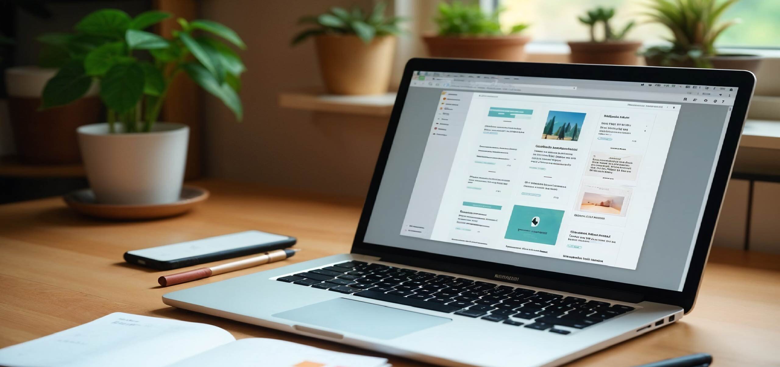
If you’ve ever opened a blank canvas and thought, “Where do I even start?” — you’re not alone. Layout design can feel overwhelming at first. But once you understand the basics, it’s way less scary and a lot more fun.
Let’s break it down in plain English — no jargon, no fluff. Just the essentials to help you design clean, clear, and good-looking layouts.
1. Understand What Layout Actually Means
A layout is how you arrange stuff on a page or screen.
Think of it like organizing your room. You decide where the bed goes, where to hang the lights, and how to keep the space functional and nice to look at.
In design, it’s about placing text, images, buttons, and other elements in a way that makes sense to the viewer.
- People find what they need fast
- Your message comes across clearly
- Everything feels visually balanced
2. Start With a Grid — Always
Grids are your layout’s backbone. They give your design structure and rhythm. Even if your layout looks creative or “free,” chances are there’s a grid underneath keeping everything aligned.
- Use a 12-column grid for web layouts.
- Use a basic 2–3 column layout for print or presentations.
- Keep equal spacing between elements.
Grids don’t limit you — they guide you. And they make your work feel cleaner and more intentional.
3. Learn to Use White Space (a Lot of It)
White space — also called negative space — is the empty space around elements. New designers often try to fill every inch of the canvas. But the best layouts breathe.
- Separate sections
- Add focus to headlines or images
- Make text easier to read
Pro tip: If something feels “off,” try adding more white space before changing anything else.
4. Hierarchy = Visual Order
Hierarchy is just a fancy way of saying: “What should the viewer see first, second, third?”
- Size (big things stand out)
- Color (bright or dark elements grab attention)
- Position (top-left usually gets noticed first)
- Contrast (light on dark or dark on light stands out)
If everything looks equally important, nothing stands out.
5. Alignment Makes Everything Look Smarter
Even the best designs fall apart if stuff’s not aligned. Text randomly placed. Images floating weirdly. Buttons slightly off-center. It all adds up.
- Text and elements line up with your grid
- Similar things are aligned the same way
- Margins are consistent (top, bottom, sides)
6. Choose One Focal Point Per Section
Each screen or page should have one main message. Don’t crowd your layout with too many ideas.
- Break up content into sections
- Use one bold heading or image per section
- Keep secondary info subtle
Think of it like a conversation. You talk about one thing at a time. Your layout should do the same.
7. Use Consistent Spacing
Spacing matters as much as the content itself. If buttons are different sizes, or there’s weird gaps between things, people notice.
- Use a consistent spacing system (e.g., 8px, 16px, 24px…)
- Group related items close together
- Leave enough space between groups so things don’t feel crowded
8. Typography Can Make or Break Your Layout
- Use 2 fonts max (1 for headings, 1 for body text)
- Make sure the font size is readable — not tiny
- Use bold for emphasis, not italics or underlines
- Stick to left-aligned body text for better readability
Also, line spacing matters. Tight text is hard to read. Give it some room to breathe.
9. Keep Things Simple
Beginner layouts often try to do too much — too many colors, fonts, effects, shadows. Resist the urge.
- One or two colors (black + 1 accent)
- One font family
- Simple shapes and clean lines
10. Use Repetition and Patterns
Consistency helps people feel oriented.
- Button styles
- Headings
- Icon shapes
- Spacing rules
11. Group Related Items Together
This is called proximity, and it’s one of the easiest ways to improve any layout.
If things are related — like a heading and a paragraph — place them close together. If they’re not related, give them space.
12. Use Real Content Early (Not Placeholder Text)
It’s tempting to use lorem ipsum or dummy images. Don’t. Design with real text, real headings, and real calls-to-action.
- Your text blocks are too long
- Headlines are awkwardly breaking
- Buttons need better spacing
13. Mobile-First Isn’t Just a Buzzword
Start small — literally. Design for mobile first. That way, you’re forced to focus on the most important content and layout decisions.
Once the mobile version feels right, scale it up for tablets and desktop. This also keeps your layout clean and focused.
14. Test Your Layout Often
Don’t wait until it’s “done” to get feedback. Share early drafts. Ask a friend:
- “Is this easy to understand?”
- “What do you notice first?”
- “Anything feel confusing?”
15. Save Inspiration, Not Just Pinterest Boards
Whenever you see a layout you like — a landing page, a brochure, an app screen — ask yourself why it works.
You learn best by copying structure, not copying style.
Final Thoughts
Layout design is part art, part logic. It’s about making things easy to see, read, and understand.
- Stay organized
- Be consistent
- Keep things simple
- Trust your eye (and test with others)
Every great designer was once a beginner. And every strong layout starts with a few smart choices — made one block at a time.
Join Our Mail List
To get latest updates on courses and news regarding education.